

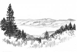
I steady my stool on the uneven ground and open my pack. For this grand vista I pull out an 11×14 inch piece of Arches hot-pressed watercolor paper. This artist quality paper has a smooth surface and can take a certain amount of moisture without buckling. It dries fast and is ready for inking in a short time. I clamp it to a 1/4″ Masonite board (Don rounded the corners for easy handling), then I dig out my tube of charcoal grey watercolor, my favorite brush, water can, canteen, and my metal doll-dish palette. This is the 1970s, and my art pack is a Boy Scout backpack, not too large, a simple rectangular design, with square corners and just the right dimensions for paper, board, and art supplies.
A hawk rising on the updrafts along the rim suddenly appears right in my line of sight. It banks and glides over the sage area, squawking to scare any small animal out of hiding. What a beauty. Sage perfumes the morning air, and I pause to savor a deep breath of the fragrance. It fills me with a special gratitude for just being here.
Where do I start on such an expansive landscape? I’m dealing with space and design on this one, a lesson in composition. I will take advantage of the line of trees along the downward semicircle of rim in front of me, a natural frame for the basin beyond. Linear perspective is not the main event here; it’s an example of aerial perspective. Also called atmospheric perspective, this refers to the effect the atmosphere has on the appearance of an object as it is viewed from a distance. Contrast decreases as distance increases, details diminish as they get further away. Distant colors are less saturated and usually fade to blue hues. I will need to lighten values as forms recede in the distance. Aerial perspective also has scientific causes, which is a fascinating study in itself.
To my left is a half-grown lodgepole pine; the rest of the rim forest is mixed lodgepole and juniper, with juniper scattered down the lower slopes. I dip my brush in dark grey paint and boldly stroke in tree shapes. The row of trees establishes dark values, which pulls the eye to the front of the drawing and at the same time sets off the distant scene beyond. I dab large, loose strokes for shapes of tree foliage. With paler tints of light grey I shade in the extreme foreground to suggest sage and grasses, rounding tops of shrubs and stroking vertical lines for the grasses. I set down the brush and prop the board in the sun for a few minutes before attempting the distant mountain range.
When the tree line is dry enough I continue with a simple technique for mountain contours. I stroke a dark outline for the ridges, and then while it is still wet, I pick up a bit of clear water using a separate brush and lightly touch the dark paint, pulling the thinning color in downward strokes to shape slopes and cliffs. One basic rule of watercolor is: never leave puddles on the paper. When you are not looking they become unstable, even capricious, and dry into unwanted splotches. To avoid that, I gently squeeze water out of the brush, then touch the dry tip to a puddle edge; the brush quickly absorbs excess water off the painting. The alkali lake needs very little suggestion since it is already white, just the palest horizontal brush strokes to suggest the level lakebed. With that in place, I put the sketch in the sun to dry completely…